Category

Addictive

Category

The Secret Garden, a timeless place where natural colours and harmonious shapes provide the perfect setting for our new collection pieces.

A place full of mystery, where everything seems suspended in an eternal moment, we can see and be inspired by the textures, the play of light and interesting perspectives.
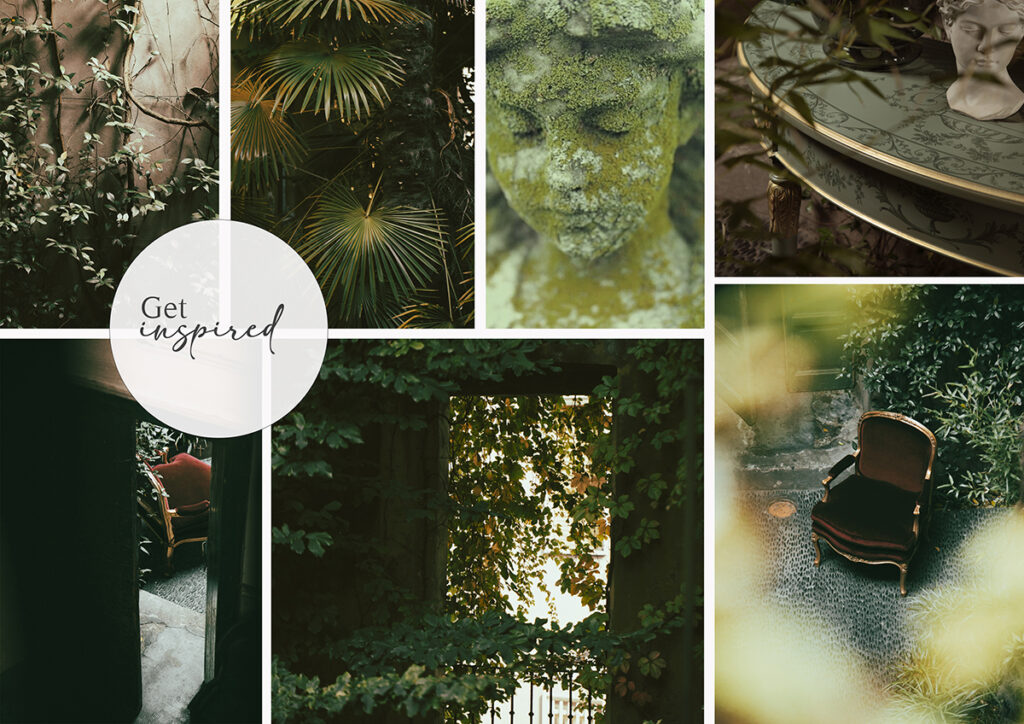
In a place where time seems to have stood still, a classic console table is created, entirely decorated by hand, the stylistic signature of our company.

It is the perfect blend of a classic product in a timeless place, and the inspiration for one of the new 2022 colour trends: High park.

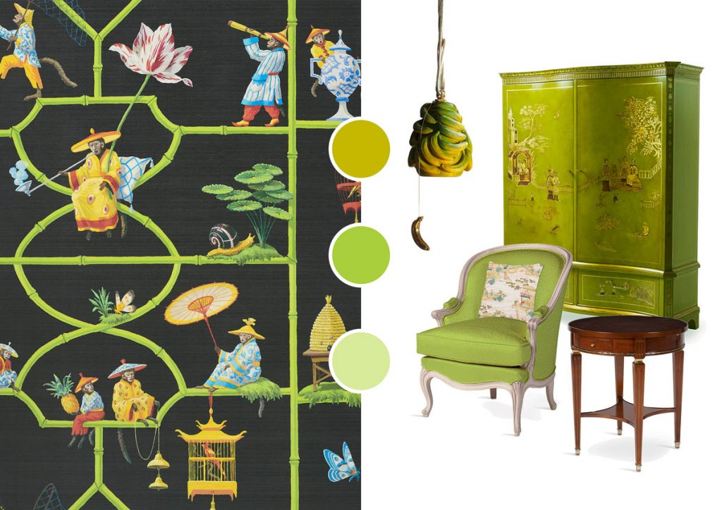
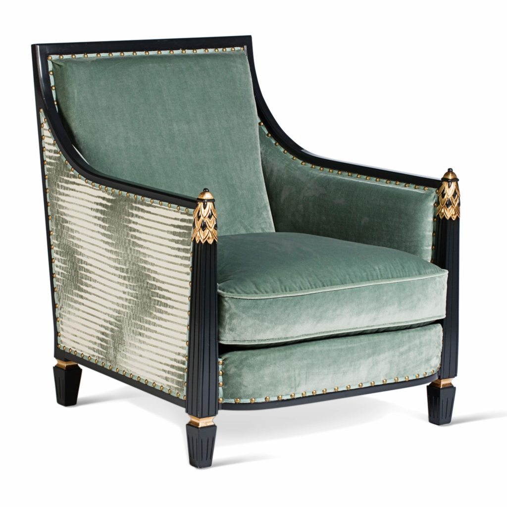
An elegant, not insolent green that blends perfectly into any room in the house.

A colour that somehow manages to sum up the everyday life of living, hobbies, personal rituals and cultural influences that determine the way of life. Green, used in all its nuances, is capable of integrating perfectly into all rooms in the home and combined with pastel colours enhances the architecture of a space.

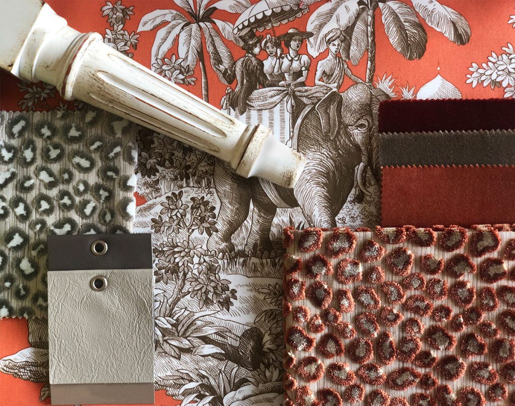
The timeless Animalier fabric accompanies our days, not only in fashion, but also in design and decoration.

Extravagant, fascinating and full of character, this type of texture will give a gritty touch to the environment.

New colours of Wilde velvet broaden the opportunity to use this charming upholstery fabric. Stylish animal spot enhanced by a horizontal stripe ground effect which adds an interesting contrast.

From bold contemporary to a more classic and delicate style, the soft cotton toile fabric embraces the cushion with its beautiful texture.

A 19th century toile showing an Indian scene at the time of the Raj. With a couple riding an elephant through a tropical jungle, complete with tigers, ostriches and Mughal palaces.

Our style office has developed a finishings proposal on this color, mixing it with neutral colors and pale pink with a modern and feminine result. A tone-on-tone combination ideal for those who love to furnish by playing with shades.

The correct word is dare, dare as much as possible, use it with bright colours such as pink. The idea is to create a play between two styles: contemporary and classic.

Playing with woods and bronzes the result will be super cool!

We love to dare; we love to be classic but always eclectic, mixing styles and playing with colors.

Acid tones are what we love most right now… striking and full of life and summer vibes!

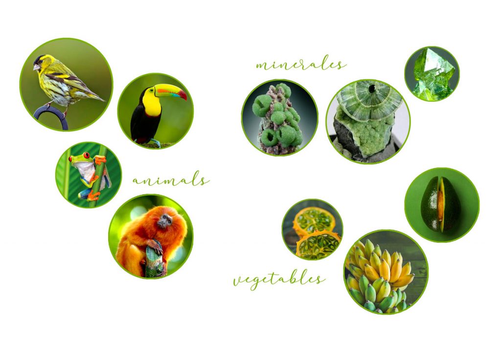
Enjoy the feeling of thousands of shades of green and yellow inspired by the wonders of nature, from rainforest animals to intense minerals and tropical vegetables. Vibrant shades to go bold: colors have the power to transform a space or a piece of furniture, even more when we are talking about a very classic bespoke handmade creation.

Just free your imagination and turn to colors, acid colors!

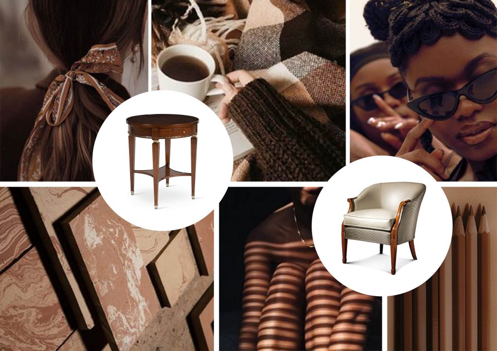
Chocolate has always been a source of inspiration, and not just for chefs and pastry chefs: artists, directors and designers from all over the world have dedicated wonderful creations to the “food of the gods”.

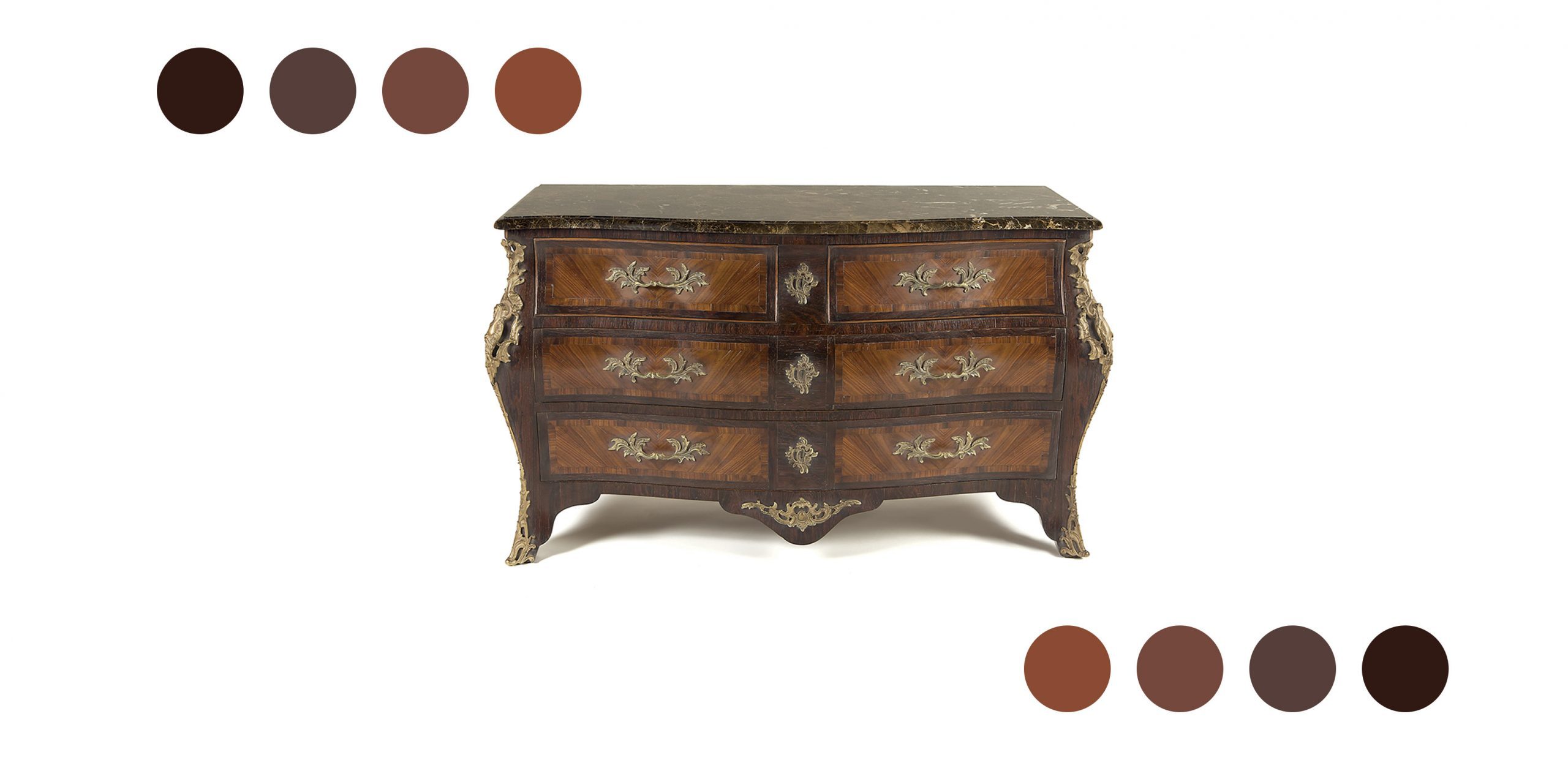
The chocolate palette has been a magical ingredient in interior design schemes the world over and across many different style tastes for centuries. We too have a real addiction for chocolate shades and we love evocate its with dark woods and refined marquetryes made joining by hand different grains of woods. The most elegant results are obtained with mahogany, cherry wood and rosewood.

Mixing classic lines with natural color of woods and golden accents it’s very simple bring chocolate’s warmth and richness to any space and give a true sense of luxury.

Chocolate shades are versatile and they can be used to implement many design ideas. The reason for this versatility is that brown is a blend of many different colours and therefore has an understandably amicable relationship with almost every other hue.

Chocolate evokes a particularly cosy atmosphere in natural combinations with colours such as cream, sand and beige – and these blends are currently extremely popular!

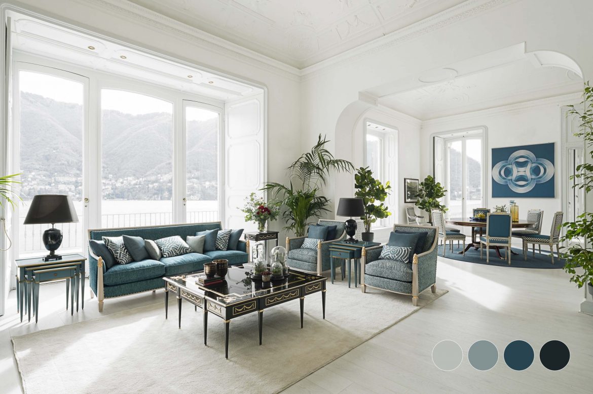
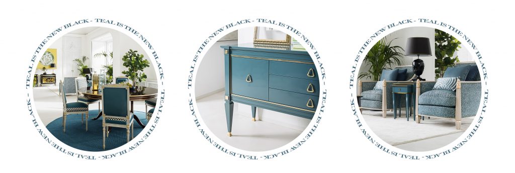
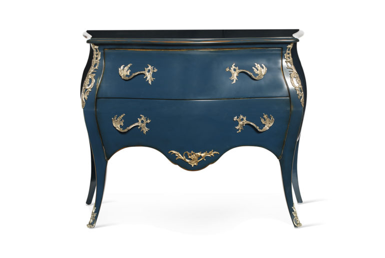
Teal is a rare, assertive, elegant color. It’s not green or blue. It’s teal! It’s the new color that did not exist, and it has replaced black in the world of luxury and exclusiveness. We love teal because it is a versatile color that’s perfect for a classic decor because it goes so well with wood. We also combined it with gold and natural hues such as taupe and beige: fabulous!

During this year we have witnessed a real invasion of “naturalist” colors in furnishings and accessories, colors inspired by landscapes of lakes, forests and woods. These are mostly balanced nuances, of neutral and muted colors, capable of bringing classic refinement to the interior.

Among these new shades, our favourite is mushroom color that can be used nearly everywhere. Although it can also be referred to as “oyster,” “taupe,” or “greige,” mushroom is itself a distinctive color—not too warm, not too cool. The most appealing thing about mushroom is its ability to work in a variety of design styles. Our style office has developed a decor proposal on this color, mixing different style and materials in an elegant set made of warm woods, soft velvets and light blue accents.

Classic Blue is the color that, according to Pantone Color Institute experts, will better interpret the character of 2020. It is a universal shade “reminiscent of the sky at dusk”, “a boundless blue evocative of the vast and infinite evening sky that encourages us to look beyond the obvious to expand our thinking; challenging us to think more deeply, increase our perspective and open the flow of communication.”

This color appeals to everyone, from lovers of chinoiserie to modernists. Universal as it is, a Classic Blue fits beautifully into timeless settings adding always a touch of sober elegance. For these reason we often use it in our decor proposals, matching it with french lines, handmade carvings and cast brass details.
And a few months ago we started using it also in our decorative experiments for the next Salone del Mobile…stay tuned!

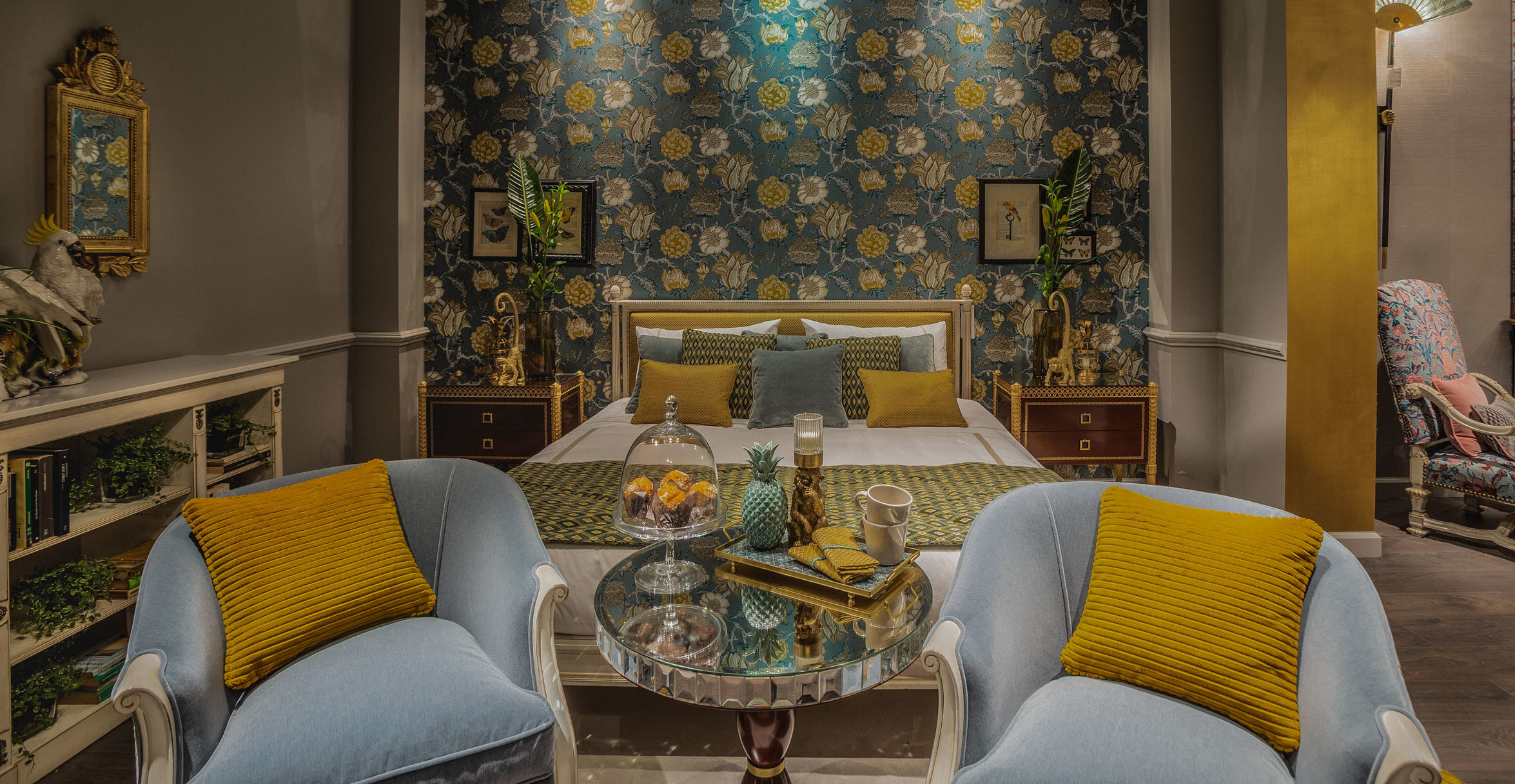
The cheerful, interesting shape of the pineapple has been a popular motif used by interior designers throughout the last years. However the pineapple as decoration is not new…already in the 18th century it was used as a symbol of power, wealth and hospitality by architects and craftsmen whom sculpting pineapples into the architecture of buildings, on gateposts, on fabrics and furniture. This curious looking fruit has inspired we too for design of our last bedroom presented during the last edition of Salone del Mobile Milano.

We have used the pineapple’s shape, colors and patterns sparingly alongside white finishings to add a colonial feel to our classic bedroom. We made precious carvings on wood and chose sophisticated textures similar to those of pineapple.

Finally we added pieces with gilded and mirror details and decorative elements to recover the historical use of the pineapple as a signifier of wealth.

This year more than ever we agree with the choice of the Pantone Color Institute experts. We think that the Living Coral will not only well interpret the character of next year, but will also be the right color to create the classics of tomorrow, pieces that escape the austere gloom of the past and take on new liveliness and colour, stylishly furnishing the present while keeping the classy elegance of its origins.

Living Coral is a warm, peachy orange nuance with a “golden undertone that energizes and enlivens with a softer edge”. According the experts it symbolize “our innate need for optimism and joyful pursuits”.

“PANTONE 16-1546 Living Coral emits the desired, familiar, and energizing aspects of color found in nature. In its glorious, yet unfortunately more elusive, display beneath the sea, this vivifying and effervescent color mesmerizes the eye and mind. Lying at the center of our naturally vivid and chromatic ecosystem, PANTONE Living Coral is evocative of how coral reefs provide shelter to a diverse kaleidoscope of color”

In 2019, therefore, we will have a good excuse to use coral, one of the colors that we believe are most suitable for enlivening the more classic pieces and for emphasizing a design with not very elaborate shapes. The right color to create a discreet luxury that does not shout but whisper to our senses.
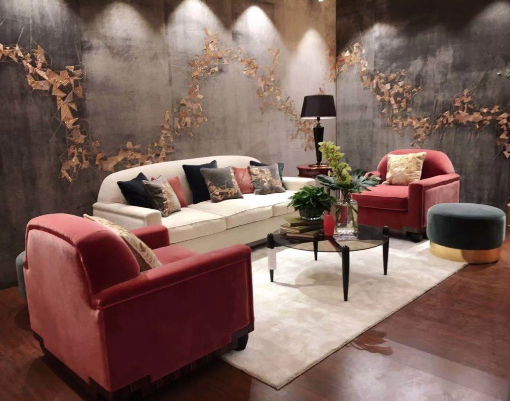
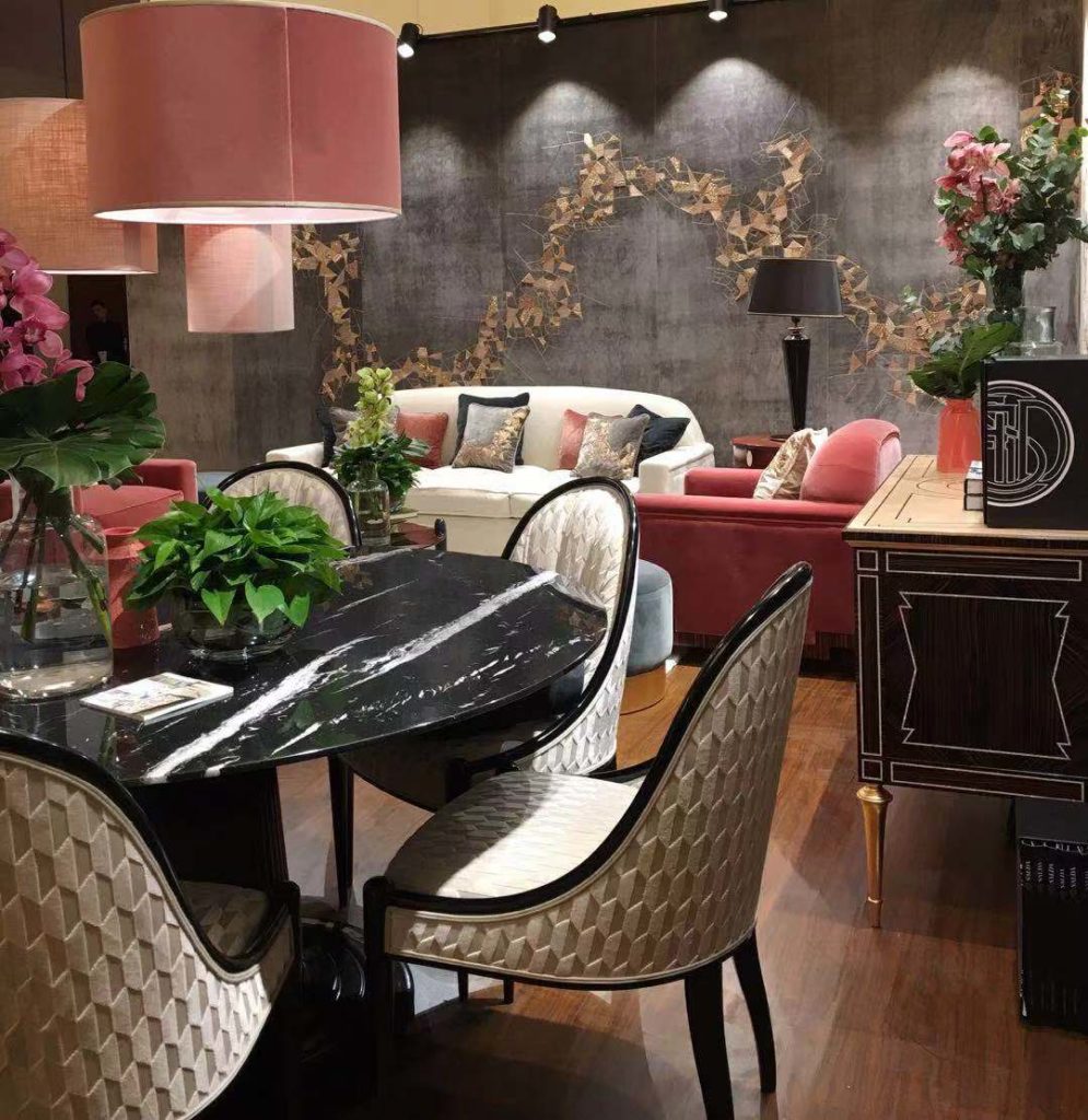
Sage green is a fascinating hue. It’s not grey or green. It’s sage green, a muted gray green color that acts neutral but is way more interesting.  We love it as a new alternative for neutrals because of its versatility: it works excellent with a wide range of decorating styles, accent colors, wood tones and metal finishes. Generally we combine it with French classic lines but recently we used it on more modern pieces inspired by the early xx century and the result was amazing! To warme its cool tones we used gilded carvings and little metal accents in brass.

We love use sage green to furnishing living rooms, because it lends the look a wonderfully warm, welcoming feel.

Despite the specific name “sage,” the hues that are contained within this category are many. Sage greens varies in lightness and saturation, but we think that with the right combination all sage green hues are stylish and stunning. A deeper sage green looks wonderfully rich when combined with furnishings and accents on the darker end of the color spectrum: burnt orange, black, and deep gold. Here’s an example!